Hughes - Gr.No.29
The link to whole project is below.
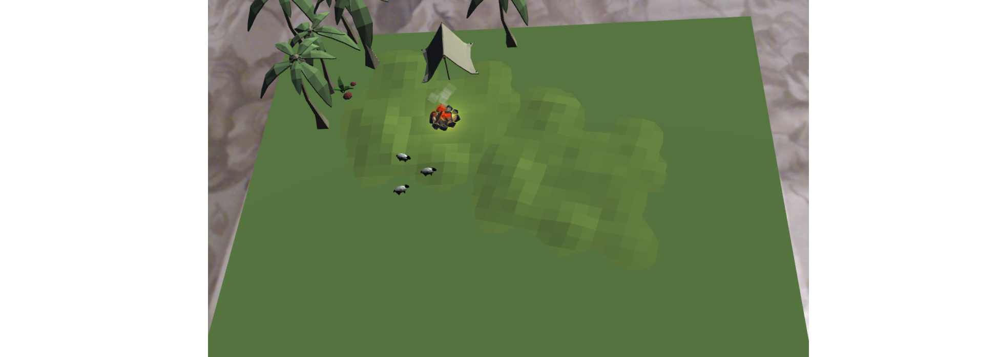
Placemat
Even though the scene is simple as mentioned but I fell it is quite nicely placed at a proper scale so as one can interpret sitting on the top of the mountain and enjoying the view. Even though the assets used in the scene appear quite small but when the camera is actually brought near to them, they appear well established. The Particle animation on the fire makes it looks even more realistic along with the fire crackling sound. The void-ness in the space of the scene on the righthand side can be understood by the constraint that space will be needed to place other targets in order to show interaction as any of the assets are placed on the mat, the color of the mat changes which presents an interactive nature of the mat.
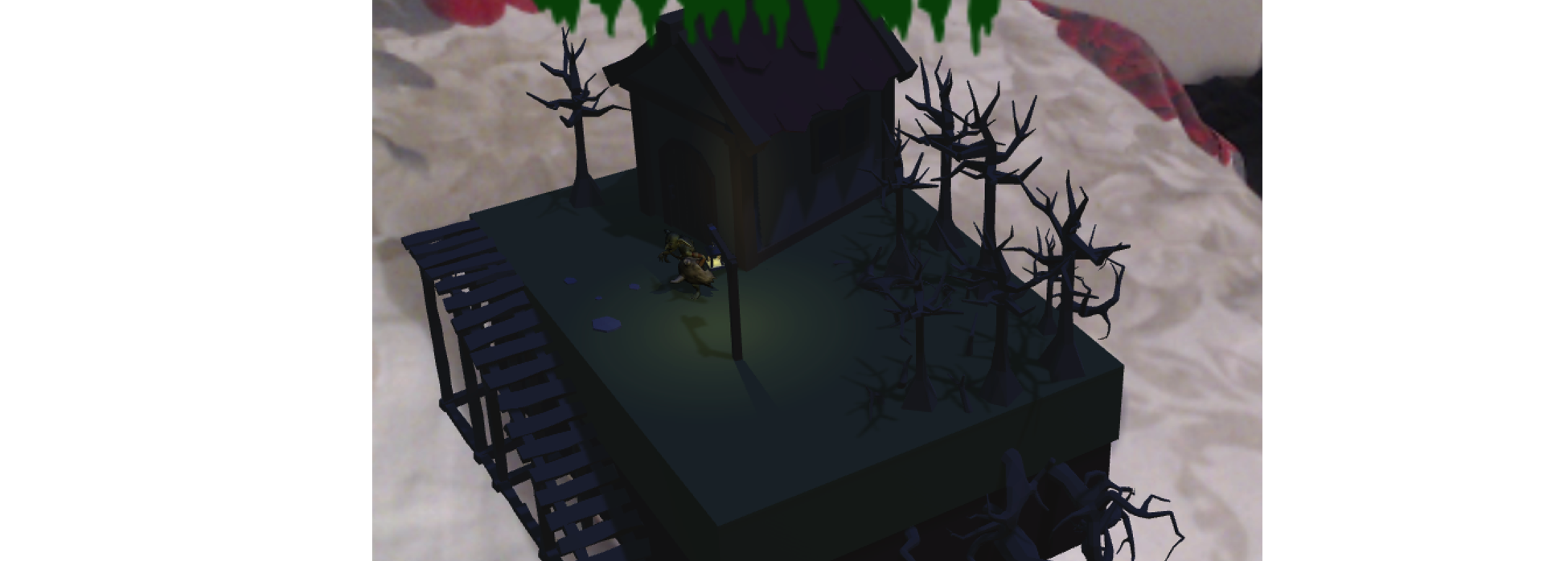
Cereal Box 1: Goblin crunch
This scene really caught my eye. It gives you a look of a haunted goblin house and with the goblin dancing outside the house. A small light source in the dark theme adds additional beauty to the concept along with the ramp. The background music is perfectly matched to the scene. However, I feel that the overall scene could have been scaled up a little bit for a more realistic look and feel.
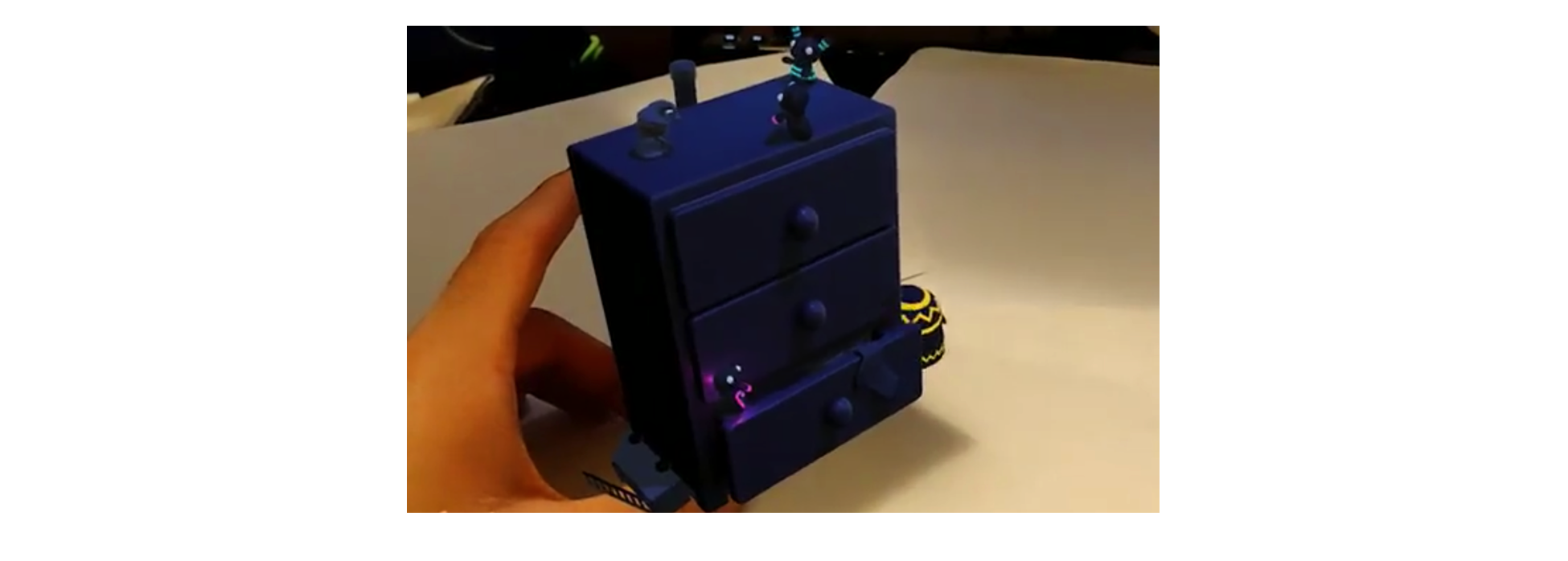
Cereal Box 2: Invaded Drawer
This scene is also too nice to comment any improvisations. The dark colored drawer has been invaded by an army of insects may be which have their own light. Like other scenes, the music un-pauses when the object is rendered.
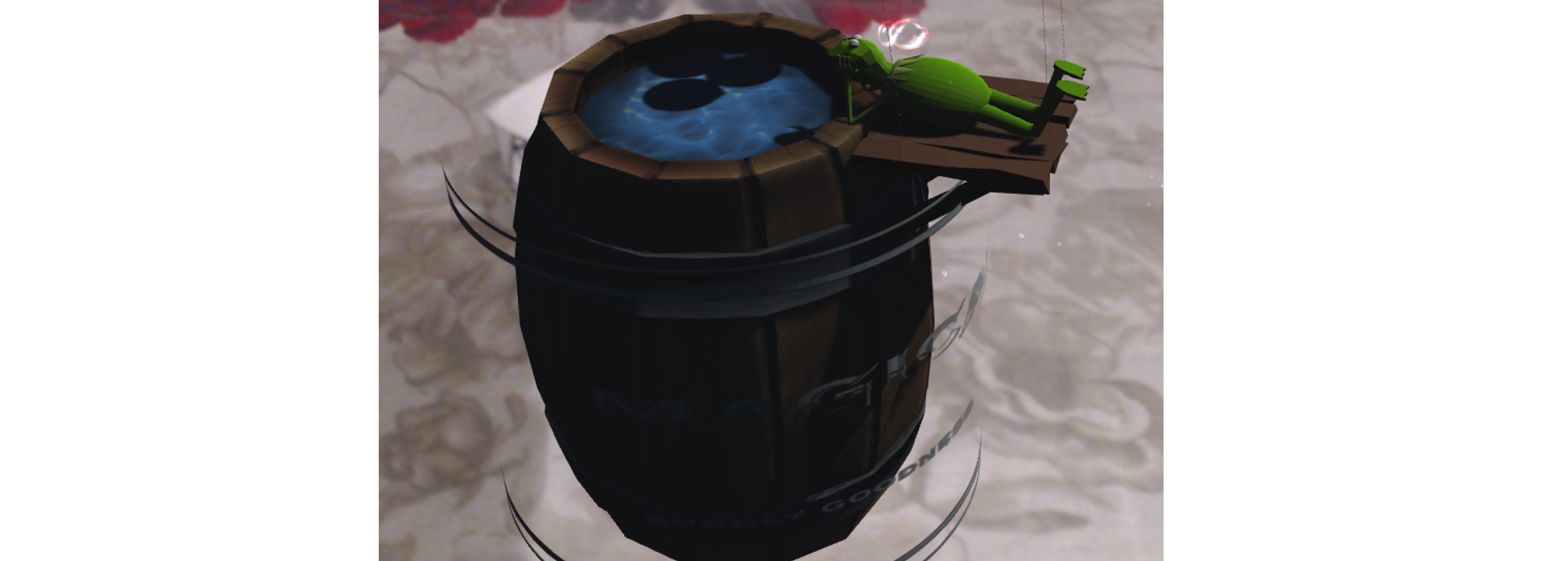
Drink Box 1: Magical Wine Barrel
This is a quite asset-full scene with the frog as a mascot. The bubbling sound and the particle animation makes the scene look even more naturalistic. If I were to improvise this scene a little bit then I would have made the barrel of a beer as it would match up more with the sound and bubbles as compared to wine. The animation of a rotating the barrel name adds up aesthetics to the scene.
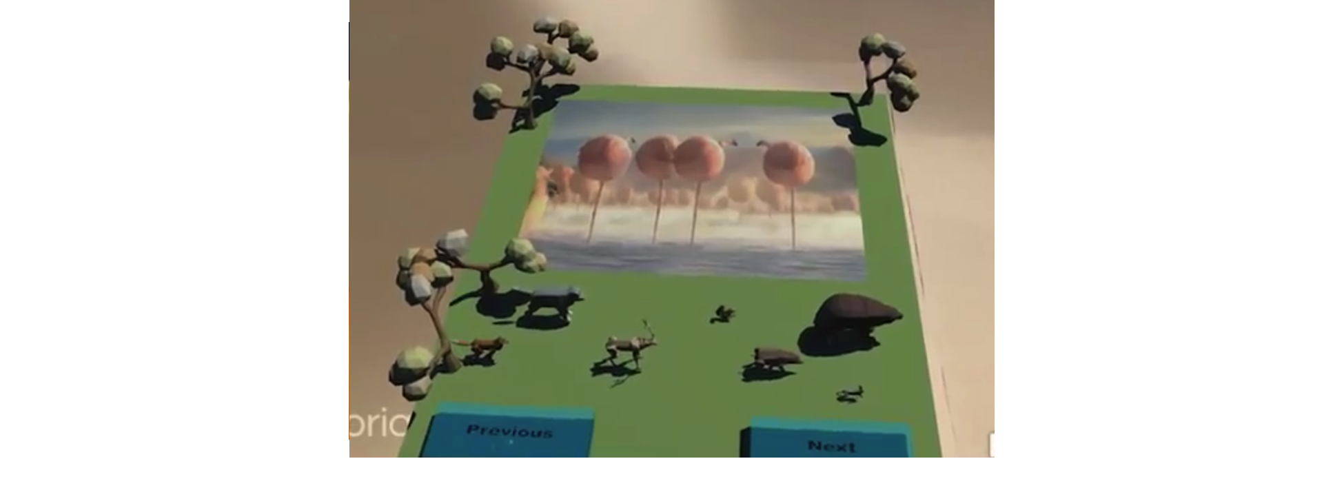
Magazine
The magazine is quite well built too, I really feel that it is quite insightful to place the name of the article tilted so that it is legible. The buttons of the magazine work quite nicely however if the buttons are placed outside the frame, as if they appear in the boundaries outside the magazine and made transparent then it will be possible for the human eye to take a feel of shadowing the button to make it work.
Copyright © 2018 - All Rights Reserved - Vinay Manchundiya
Template by OS Templates